The world of architectural drawing services is broken down into phases. These phases begin with schematic design (the proverbial “back of the napkin drawing”) and end with a set of instructions indicating the components required to put the building together. These are called construction drawings (commonly referred to as blueprints).
Through our architecture firm’s decades of experience with residential, multi-family, and commercial architectural design work, one truth has become apparent: No job for which have ever been asked to provide ONLY construction drawings has ever been fully thought through in the previous design phases.
Such was the case for this project that we took over from a local structural engineer. This five-unit, multi-family residential building in the Belmont Shore neighborhood came to us with the assurance that all of the planning, zoning, and architectural design issues had been worked out, and all we had to do was draw it up. However, in order to get approvals, we had to create an entirely new set of plans, redesign all of the units, and provide a whole new set of exterior elevations.
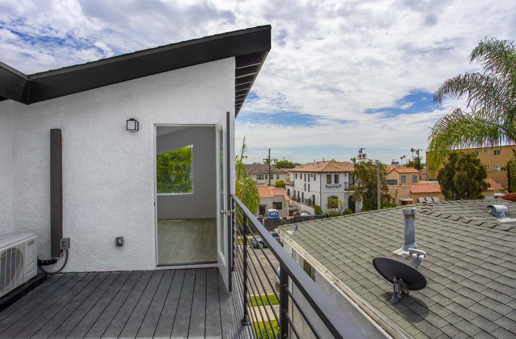
The goal of this project was to update and upgrade an existing multi-family apartment building as cost effectively as possible. The clients wanted to attract young renters by modernizing the exterior of the building. They also wanted to appeal to renters’ modern design sensibilities by including amenities like private exterior decks, private laundry areas, and upper level lofts that look onto the living space below.
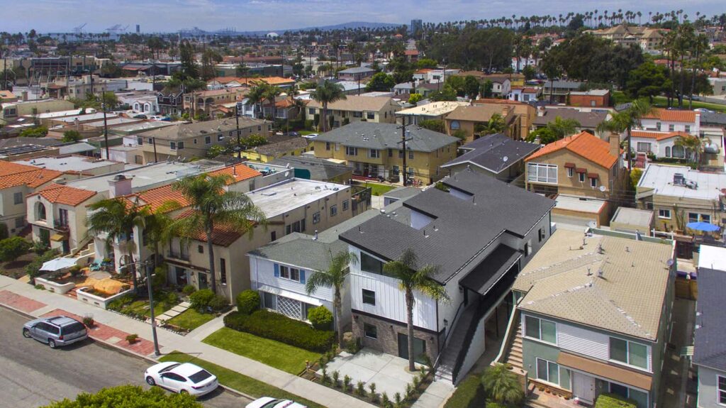
To accomplish this, we enlarged the four existing studio apartments by maximizing the building envelope (i.e. using every planning trick possible to capture interior square footage). We also updated an existing two-bedroom apartment and provided parking garages.
To enlarge the first floor, we removed the communal laundry room and instead, provided each apartment with its own private washer and dryer. This allowed us to reallocate the reclaimed space to the studio apartments on the ground floor. We designed two single-car garages at the rear of the building and, by using city planning rules, were able to maximize the size of the garages. Because the garages were new, we were able to use them to strengthen the entire building by introducing new and stronger structural components and then channeling existing structural loads to these strengthened areas. The addition of these new garages also allowed us to push the upper level living space out over them to gain even more interior space.
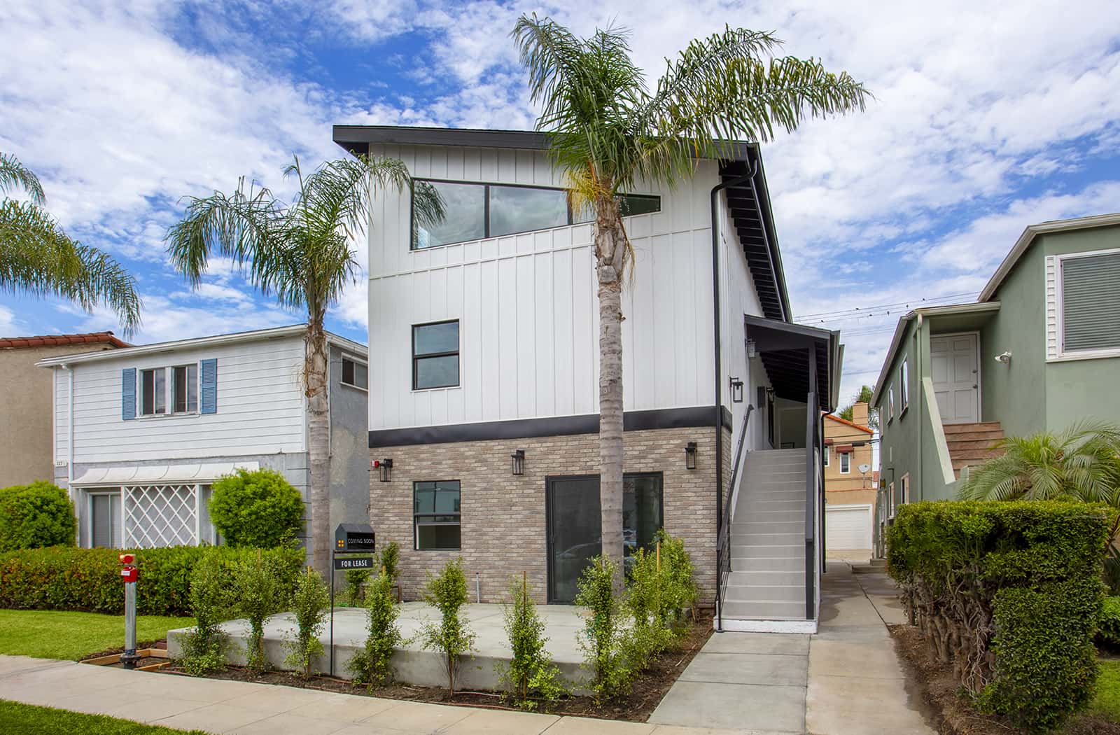
The redesign of the building’s roofline not only provided a modern update to the exterior, but also allowed us to create a loft space and decks for the upper-level apartments.
The building’s exterior has also moved away from its previous “stucco box” aesthetic to a warmer, crafted look. The exterior material enhancements, including siding and brick, also set this building apart from the other multi-family units in the neighborhood.
The challenges of this project were abundant: from having to redesign the project from scratch, to maximizing the space on a small lot, to involving consultants and city specialists to ensure our design fit within municipal restrictions. We had to do all of this while meeting the client’s requirements and budget. In the end, the project turned out great and has raised the bar for rental units in the area.


